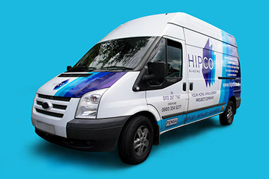


HIPCO
CLIENT: HIPCO YORKSHIRE LTD
DATE: SEPTEMBER, 2016 - PRESENT
Hipco are an independent home improvement company who are changing perceptions of the windows industry.
They are 100% customer focused and offer much more than just double glazing.
CHALLENGE
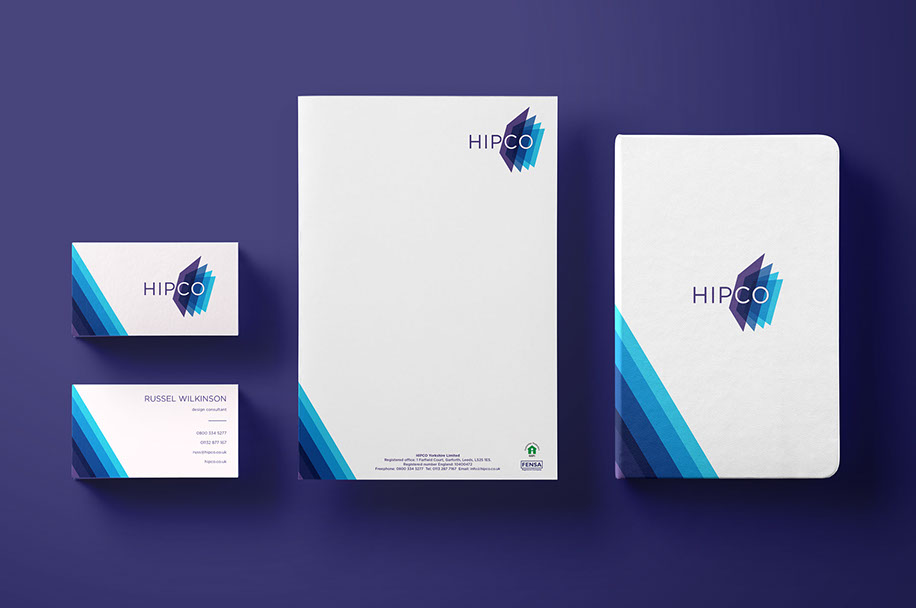
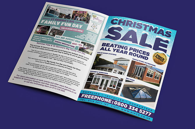
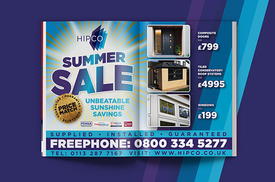
Create a identity that sits within the expected window company norms but still has a contemporary look and a down to earth tone of voice, which stands it apart from the competition. It must be easily recognisable and transferable to all customer channels.
SOLUTION
The colour palette was the obvious way to inject the window cues. Accompanied with a medium weight sans serif typeface and an logomark which abstractly depicts cascading sheets of glass, the desired look & feel was achieved. The colour palette is almost monochromatic in appearance but still has enough variation that when used correctly creates a cohesive brand image than translates easily into all consumer channels.
DELIVERABLES
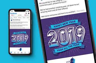
identity // advertising // social
Northern Touch Design Ltd.
71 Selby Road
Garforth
Leeds
LS25 1LR

